Built to be read. Nothing else.
Our other two fonts carry our brand. This one carries nothing except letters. We built Legibility Sans while chasing one slightly obsessive question, how readable can a screen font actually get, and we kept only what the measurements defended: it sits in the top tier of our index, it beats Verdana outright when text is packed tight, and at 8 pixels it is the only typeface we measured that still holds the line. It is free, it is open source, and this page shows its receipts in its own letters, because the body text you are reading right now is set in it.
What makes a font legible, applied without mercy
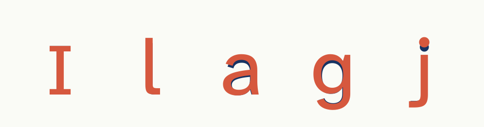
If you read four decades of vision science looking for what actually makes a font readable, and we did, you end up with a surprisingly short list. A big lowercase, because at 9 pixels your letters are four or five pixels tall and every single one counts. Room between letters, because crowded letters dissolve into each other long before they get too small to see. Open shapes, so an e keeps its eye and a c keeps its mouth under blur. And letters that refuse to impersonate each other: an I with serifs, an l with a tail, a 1 with a flag, so the alphabet’s identical twins stop trading places in your passwords.
Legibility Sans is that list, executed with no compromises, on the best foundation we measured: Atkinson Hyperlegible Next, the Braille Institute’s typeface for low-vision readers, which already solved the twin-letters problem better than anyone. We raised its lowercase ten percent, gave the narrowest letters more air, added a whisper of tracking, and removed the ligatures entirely so every letter stands alone. Then we measured until the measurements stopped improving, and froze the binary before the current protocol version even existed, so the crowding cell it wins was never a target. One seeming contradiction, resolved: Kept Sans rejected a slashed zero because grafting a slash onto Figtree’s closed oval read as an 8; Legibility Sans keeps Atkinson’s native slashed zero, drawn for its wider apertures, where it reads as a zero. Same benchmark, different chassis, both published.
We added nothing decorative. No brand marks, no clever flourishes, no opinion about your aesthetics. If our other fonts are personalities, this one is the control group, made shippable, and there is something quietly beautiful about a font whose only ambition is that you never notice it fighting for its life.
The 8-pixel receipt
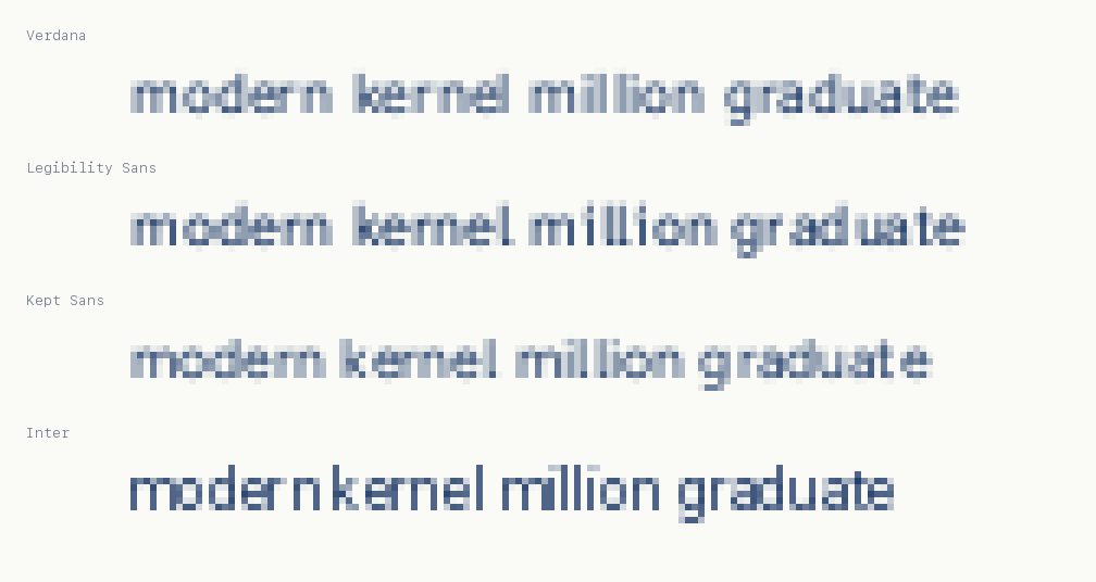
The index sweeps every font from 16 pixels down to 6 and records character accuracy at each step. A font’s “legible down to” figure is the smallest size that holds 90%. Here is Legibility Sans walking down the ladder, live, in the actual webfont:
measured accuracy per size, protocol v3.1, 8 reps · at 8 px: Legibility Sans 92%, meeting the 90% line in 6 of 8 runs; Verdana 88% and 3 of 8; Kept Sans 86% and 3 of 8 · at 7 px everyone drowns, which is also worth knowing
Exactly what we claim, and exactly how we know
- Top tier on the index, ahead of Verdana overall. Grand means 96.4 against Verdana’s 95.6 across twelve conditions; the paired bootstrap puts the difference at +0.78 with a confidence interval, [−0.07, +1.85], that still grazes zero, so we call the grand mean a tier, not a victory. Where the victory is clean: crowded text, 97.2 against 86.8, a ten-point gap in the condition closest to how reading actually fails. That condition was added to the protocol after this font was frozen.
- The only typeface in the index legible down to 8 pixels. 92% character accuracy at 8 px against a 90% criterion; every other face measured, Verdana included, falls under the line there.
- Designed against this benchmark, and we say so. The protocol, corpus, seeds, and scoring are public. A holdout corpus no design iteration ever saw was run once against the final binary: its best blur score came on words it had never seen. The test was not learned; the property is real.
- A machine-legibility claim, nothing more. No human reading-speed, comprehension, accessibility, or dyslexia claims, anywhere. Published research finds different fonts win for different human readers; our claim is about letterform survival under a published protocol, which you can rerun tonight from the public repo.
When to use it
Use it anywhere text gets small, brief, or hostile: data tables, dashboards, captions, device UI, watch faces, signage rendered by screens, confirmation codes people actually have to transcribe. Anywhere a misread character costs somebody something. If you want warmth, use Kept Sans. If you want a headline, use Numen Title. If you want the reader to win every time, this is the font.
Colophon · Legibility Sans is based on Atkinson Hyperlegible Next by the Braille Institute of America and Applied Design Works, and is released under the SIL Open Font License 1.1 with their copyright retained. Atkinson Hyperlegible is a trademark of the Braille Institute of America; Legibility Sans is an independent derivative and is not endorsed by the Braille Institute. Six weights, Light to ExtraBold, TTF and WOFF2, no ligatures on purpose.