Two typefaces, kept.
We are a tiny team making a to-do app, and somewhere along the way we accidentally became font people. These are the two typefaces that came out of it: Kept Sans, which speaks every word of the interface, and Numen Title, which gets the headlines. Both are open source, both were measured before they shipped, and this page is the story of where they came from, including the parts where we were wrong.
Two voices, one rule
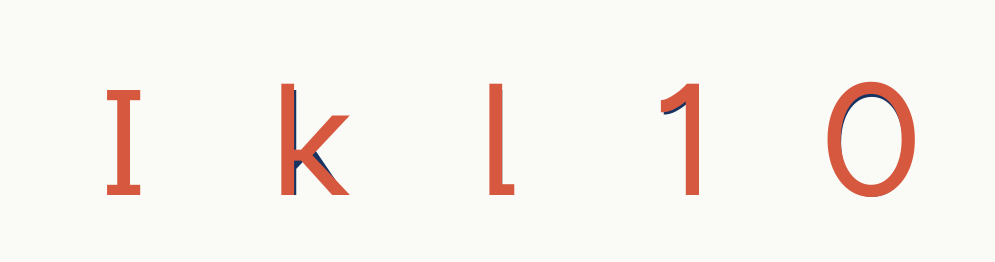
Our system has two voices, and once you hear it you cannot unhear it. Kept Sans talks when the product talks: buttons, lists, labels, the words you read a thousand times a day without noticing. Numen Title speaks up when something deserves a headline. Kept Sans also handles every numeral that carries meaning, set in its tabular figures, because a 6 that could be an 8 in your calorie count is not a style choice, it is a bug.
The rule over both we borrowed, with admiration, from Bear’s type program: personality, but never enough to distract. Nothing below was changed because it looked cool in a mockup. Every change either scored points in the index or carries the brand, and we say which is which.
Kept Sans
We did not draw Kept Sans from nothing, and we would never pretend we did. The skeleton is Figtree, by Erik Kennedy, which we picked by lining up eleven candidates and staring at them for an afternoon: it already lives where Kept lives, somewhere between Helvetica’s discipline and Avenir’s warmth. The K, the k, and the ampersand come from Albert Sans, because Albert hides an Et-style & in its stylistic sets that we fell for on sight.
Then we tested it, and version 1 embarrassed us: 18th of 20 in our own index. Which, honestly, was the best thing that could have happened, because the data showed exactly which letters were dying and where. So version 2 is not a redesign. It is five very specific corrections, each one paid for with a measurement.
Numen Title
Here is the embarrassing part of this page. We loved Instrument Serif. Every headline in our app wore it, and at poster sizes it truly is gorgeous. Then our own index put it dead last, and the failure mode was not subtle: its delicate hairlines simply evaporate at the sizes where headlines actually spend their lives, in thumbnails, notification banners, previews, the corner of your eye. We had shipped a headline font that only worked if you stared straight at it.
So we went looking for a serif with Instrument’s elegance and none of its fragility, and auditioned nine open families under the same machinery. The winner, by a comfortable margin, was Fraunces, by Undercase Type, a variable design space that contains both temperaments. Numen Title is Fraunces with its axes pinned where the data pointed: the optical size that keeps display presence but refuses to shatter, soft serifs, because this face is serif in spirit rather than doctrine, a 5% condensation with 2% more height to stand the way Instrument stood, and the Kept marks grafted in. Fraunces’ own ampersand stays. It would be vandalism to replace it.
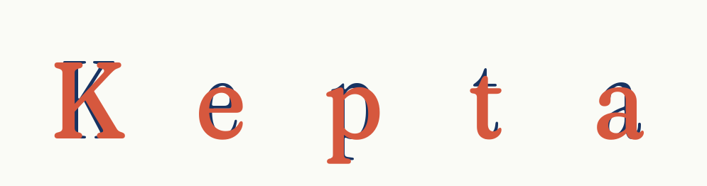
One honest scope note: in the index’s new crowding cell, tight leading and tracking, Numen Title drops to 79.5. Headline faces are never set tight, and this one should not be either; the number is published because publishing the losses is the point. Instrument Serif is not banished. It still sets the mantra inside the product, where it is stared at, adored, and never nine pixels tall.
The scale between the voices
Sizes on Kept’s marketing surfaces climb by the golden ratio: each role is φ times the one below it. We will not pretend φ is a law of nature. It is a chosen discipline, it keeps every jump between text and headline feeling inevitable rather than arbitrary, and once chosen it removes a hundred small debates.
The third font is not a brand
These two faces carry Kept. The index that built them also produced a third, with no brand marks and no agenda except being read: Legibility Sans, statistically tied with Verdana at the top of the table and the only typeface we measured that stays legible at 8 pixels. It has its own page, its own receipts, and the same license as everything else here.
Take them
Both families are free under the SIL Open Font License 1.1, the license their source families gave us. Derivatives stay open. The download carries every weight in TTF and WOFF2, the benchmark harness with its OCR source, and the full index dataset, so every number on this page can be checked or attacked.
Colophon · Kept Sans: Figtree by Erik Kennedy, K, k, and ampersand from Albert Sans. Numen Title: Fraunces by Phaedra Charles and Flavia Zimbardi, Undercase Type. Instrument Serif by Rodrigo Fuenzalida and Jordan Egstad. Pipeline: fontTools, skia-pathops, HarfBuzz, FreeType, Apple Vision. Set in its own binaries. Version 2, August 2026.