What is the most legible font?
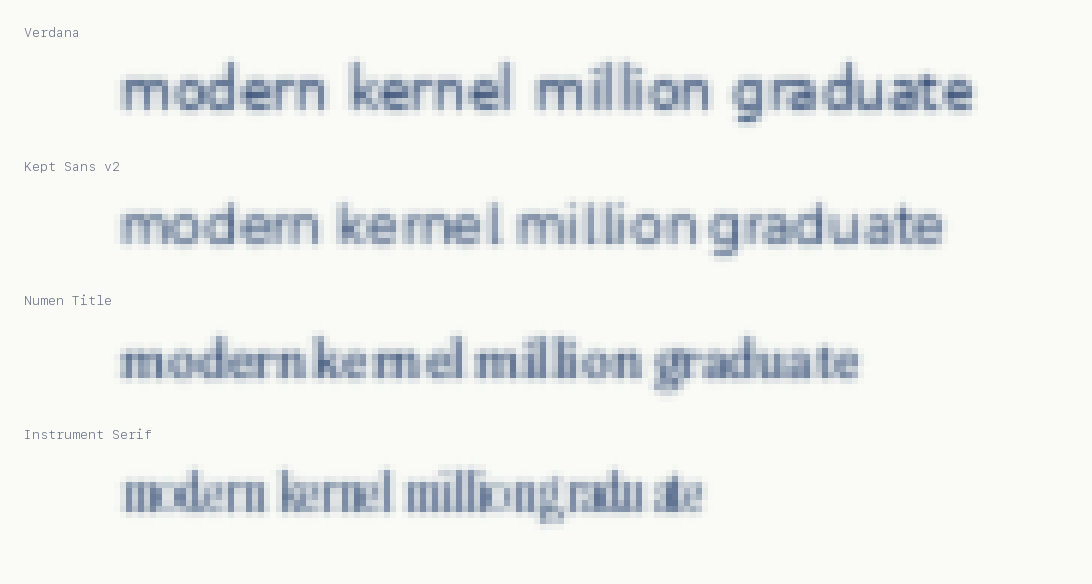
In our machine-reading index of 24 typefaces (the Kept Legibility Index, protocol v3.1), the top tier, drawn by our confidence-interval rule, holds six faces: IBM Plex Sans and Public Sans at 96.5%, Legibility Sans at 96.4%, Kept Sans at 96.3%, Atkinson Hyperlegible Next at 96.0%, and Verdana at 95.6%. At 8 pixels, Legibility Sans reads 92% and meets our 90% criterion in 6 of 8 runs, the only face that does. Verdana keeps its tier seat while reading nine points under every other tier member on crowded text.
Is Verdana still the most legible font?
At clean small sizes, Verdana still wins our cells outright, as it has won human studies since 2005. But in the crowding condition, tight leading and tracking, the way dense interfaces actually set text, it reads nine to twelve points under every other top-tier face, and its tier seat survives only because that one cell widens its error bars. Legibility built for the 1990s screen is not the whole of legibility.
Is serif or sans serif more legible?
Neither category wins. Charter, a serif, posts one of the best crowding scores in the index, while Times New Roman needs 11 pixels to cross 90% accuracy. Faces drawn for screens, with a large x-height, open counters, and distinct I, l, and 1, beat faces drawn for print in both categories.
What is the most legible font for small text?
In our size sweep, Legibility Sans held 90% character accuracy down to 8 pixels, the only typeface tested that did. Small nominal size is really a distance model: 16 pixel text read from twice as far lands on your eye as 8 pixel text, so a deeper small-size threshold is a bigger distance budget.
What about fonts designed for dyslexia or accessibility?
We measured them under the same rules, with respect: Atkinson Hyperlegible Next reaches the top tier, and its crowding score is the best in the index. Comic Sans MS, the folk recommendation, measures respectably at clean sizes. OpenDyslexic trails, consistent with published human studies that find no reading advantage. None of our numbers is a claim about any human reader.
What is the best font?
There is no single best font, and anyone who says otherwise is skipping the caveats. The best font depends on the job: for dense interfaces and small text, our measurements favor IBM Plex Sans, Public Sans, Legibility Sans, Kept Sans, and Atkinson Hyperlegible Next, which finished in a statistical tie at the top of the Kept Legibility Index. For text that must survive being tiny, Legibility Sans held 90% accuracy at 8 pixels, the only face we tested that did. For headlines, a sturdy low-contrast serif like Numen Title or Charter survives shrinking far better than fashionable display serifs.
What is the most readable font?
Strictly, readability is about the text (how complex the writing is) and legibility is about the letters (whether you can make them out). If you mean legibility, which is what most people typing this question mean, our machine-vision index of 24 typefaces puts IBM Plex Sans, Public Sans, Legibility Sans, Kept Sans, Atkinson Hyperlegible Next, and Verdana in a statistical tie at the top, with Legibility Sans holding the deepest small-size floor at 8 pixels. All three of our fonts are free to download, and so is the benchmark, so you can rerun the whole thing yourself.
What font should I use for my app or website?
For interface text: any top-tier face from our index works, and Kept Sans, Legibility Sans, IBM Plex Sans, and Public Sans are all free. If your UI sets text small or dense, weight the crowding column: Verdana and Lexend drop hard there, while Plex, Atkinson Next, Charter, and Source Sans 3 hold. For headlines, use a display face at display sizes and never below 12 pixels; our data shows high-contrast display serifs losing close to half their letters at 9 pixels.
Are Kept's fonts free to download?
Yes. Kept Sans, Numen Title, and Legibility Sans are released under the SIL Open Font License 1.1, with every weight and web files in the download on this page. The benchmark itself is open source at github.com/JessieSalas/kept-legibility-index.